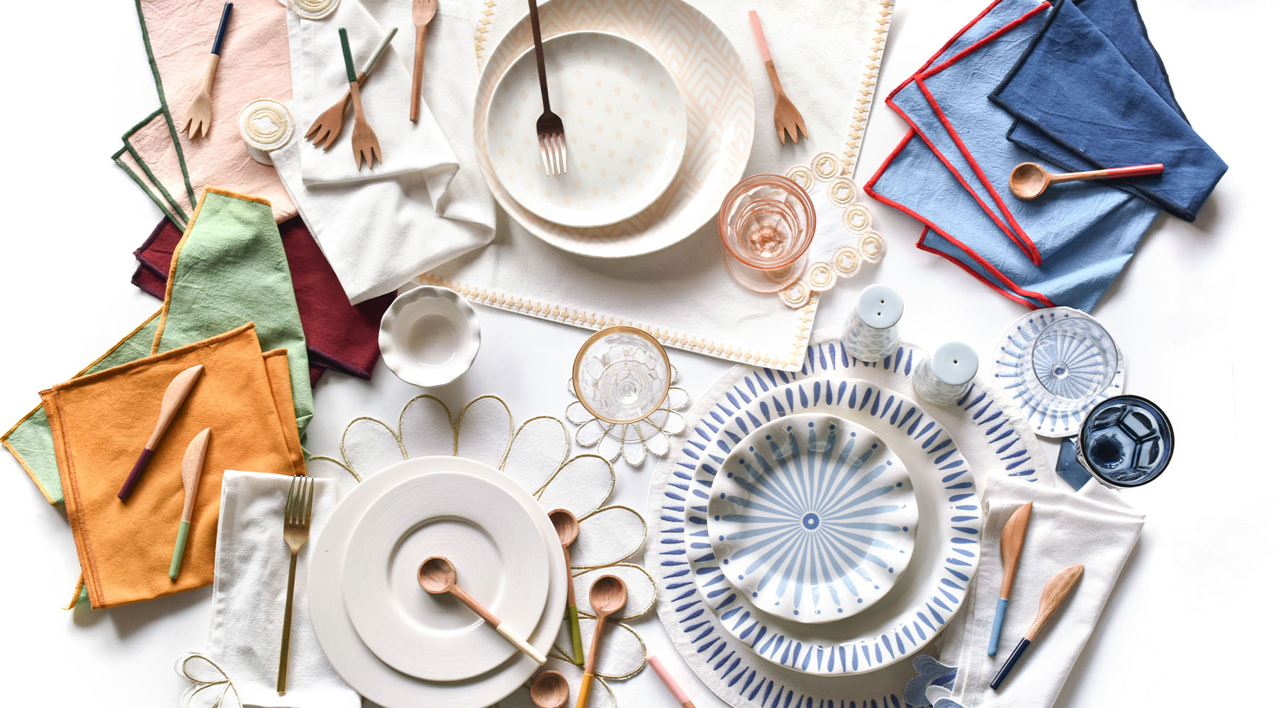
When we launched our brand-new Fundamentals Collection last summer, we knew it would become a favorite for many due to the extensive offering of a new material and saturated colors that would provide infinite more table design opportunities. That being said, we definitely underestimated the response we would receive from our beloved customers like you, and have continued to be blown away by the continued support of this collection! So much so, we are adding even more designs to the Fundamentals Collection later this year! When we first set out to design our Fundamentals Collection, we wanted the collection to include pieces that could take you from season to season with ease and become your new “go-with-everything" favorites. Designs that could be easily layered with any collection and color palette to create a look that speaks to every style. Along the way, our family quickly discovered just how much we personally love this versatile collection and we were inspired to share some of our favorite pieces and how we layer them to create a unique table setting to suit each of our own styles. Take a look!
Laura
“While designing my curated spread, my mind immediately jumped to everything spring – a beautiful time of year. Spring provides a nice change from the holiday colors of reds, burgundies, and hunter greens to new, fresher hues.
All it took for me to get inspired to create my setting was a quick look around my backyard. I was inspired by the idea of fresh-feeling outdoor gatherings, and wanted to incorporate a few natural elements – like the ferns included here – paired with the texture from the Acacia wood as the background hue with blush as the perfect neutral complement.
While I absolutely LOVE color, sometimes my mood tends towards the calmness of single colors mixed with natural elements, especially at the start of a new season. This mix perfectly met my mood and I’m excited to use this look during the upcoming warmer months for a potential luncheon or spring dinner with grilled favorites.”
Laura, Founding Artist & CEO
Kyle
"I love to play with color and find new and unique combinations to really lean into a particular look. To me, a color combination sets the tone for an overall feel – whether it be an outfit, the décor of a room in a home, or even a table setting.
When challenged to put together a styled set using pieces from our Fundamentals Collection, I immediately pictured a combination I knew I wanted to create since the launch of these new designs last year - Brass Color Block Napkins, the warm tone of the Acacia wood material, and my favorite Sabre Tortoise flatware.
This table setting would be perfect for a family dinner that I wanted to elevate a bit, but I would save it for an evening that’s dark by the time we’re sitting down to eat so it feels cozy and intimate.
I also think by adding a few festive touches like brass or crystal candlesticks with marbled taper candles, you could dress this up for a fun girls’ night or birthday party. If you lose the pink flowers and go with a more masculine centerpiece like shed antlers, vintage duck decoys, dried foliage, or even pheasant feathers, the basics of this table setting would make for a striking look for a gathering to celebrate a Mr. in your life – My husband’s birthday is coming up next week, so I’m bookmarking this idea for then!
To me, the simplicity of this look could take on so many different styles by switching up the centerpiece, so I think it’s the perfect setting to ‘save’ for later.”
Kyle, Creative Director
Sara Kate
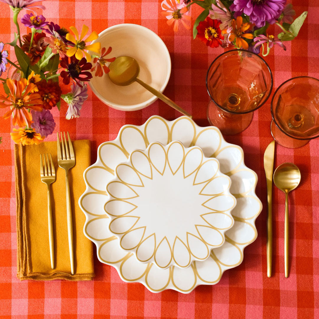
"Give me a design challenge, and I go for the gold – in this case, literally! For my curated table setting, I chose to feature a few of the latest additions to our Deco Collection along with my favorite color block napkins from the Fundamentals Collection pages to instantly elevate a more subtle table.
This collection is perfect for any season and features a few smaller-scale serving pieces that I found useful for a lighter menu. Later this spring, I’m hosting a few girlfriends for brunch to watch the coronation of Charles and Camilla and this table setting will be the perfect addition to this royal event.
My favorite color is green, so I included the Color Block Sage and Brass Napkin to complement the gold designs. To me, this look says - timeless and springy.”
Sara Kate, Photographer
Mary Parker
“The moment I saw the coquette color, I knew I had to get my hands on it! The warmth of the color paired with the Acacia wood dinnerware instantly sets the tone for a cozy mood.
This inspired me with a set table featuring all Fundamentals dinnerware pieces paired with the Color Block Coquette Napkins as the complementary hue. This setting reminds me of a cozy autumn night where it’s not too chilly, but we are excited for the cooler days ahead. The menu would include a theme of French foods paired with a candle lit table. I’ll feature a few new glassware pieces and flatware (currently on my wedding registry!) and eagerly await to host this cozy gathering this autumn.
I love how there are so many ways to mix and match with Fundamentals and even the simple addition of changing out the napkin can create a brand new table!”
Mary Parker, Merchandising Manager
Taylor
“Recently pink and green have been my go-to colors – I love the feminine look paired with the texture of the wood pieces. This table setting was not only an easy set up but allowed for a more casual gathering.
I’m planning on hosting a girls’ night soon with wine and light bites. I found a delicious deconstructed bruschetta recipe that I plan to serve on a large wood board to tie in the look and I’ll include the Fundamental Wood Ruffle Salad Plates since they are the perfect size for serving appetizers.
The beauty of this setting is that it can be put together easily but still brings an elevated look to the gathering.”
Taylor, Retail Operations Manager
Courtney
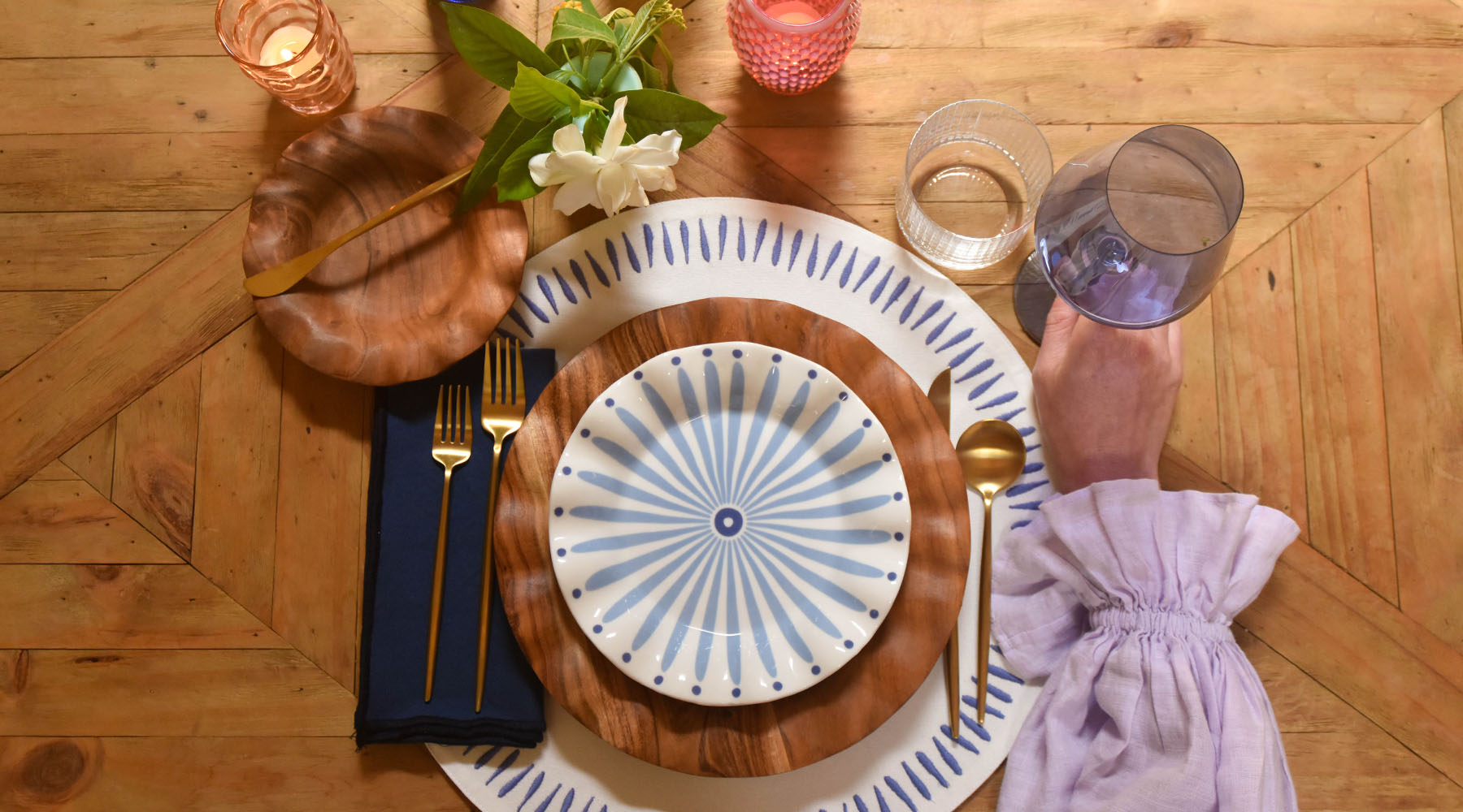
“As I set out to create my curated table setting, I quickly pinpointed the fact that one of my favorite ways to curate a place setting is to incorporate dimension, whether it’s through mixing dark and light colors or through adding unique textures. I found that the darker wood from the Acacia wood dinnerware and the color block napkin really makes the Iris Blue Burst Ruffle Salad Plate stand out and brings a moody element to the scene.
I’m a huge texture person and love mixing materials to make a table setting more experiential. With this one place setting, a person could experience at least 5 different textures between the wood, ceramic, linen, glass, and metal all in one spot.
This setting can be used for any type of gathering. By incorporating the darker colors and textures with the lighter pieces, you can use this look anytime of the year, whether it’s spring or winter.”
Courtney, Finance Director
Marcie
“I have my sights set on summer with my table setting design. While in Switzerland this summer, I plan to use this collection for hosting outdoor gatherings with friends since the weather is absolutely gorgeous. The Fundamentals Collection is perfect for outdoor entertaining, especially when visually complementing the many window boxes of bright red geraniums found throughout Switzerland.
This bolder hue ties into so many seasonal holidays in both America...and Switzerland. Red is their color of choice!
I used the mix of the buffalo pattern and paired with the wood pieces to add a contrasting element to the classic buffalo check. To me, this setting feels casual and traditional but the “upgraded” designs gives it a fun twist.”
Marcie, Facilities Director
Get inspired to curate your next table setting with a bit of Fundamentals paired with your favorite designs. Feel free to get creative and incorporate a theme with your setting. Your look can be whatever suits your style!
Want to learn more about this striking collection? Head on over to our blog where we dive into the behind-the-scenes view of this latest collection and discuss how you can style your table and home with these foundational pieces and shop the whole collection here.


 Fundamental Wood Ruffle Platter, Fundamental Wood Ruffle Dinner Plate, Fundamental Wood Ruffle Salad Plate, Color Block Coquette Napkin


 Buffalo Ruffle Dinner Plate, Fundamental Wood Ruffle Salad Plate, Buffalo Ruffle Small Bowl, Color Block French Blue and Red Napkin, Fundamentals Red Wood Appetizer Utensils



Leave a comment
This site is protected by hCaptcha and the hCaptcha Privacy Policy and Terms of Service apply.