Choosing the Perfect Color Palette for Your Next Party
When you’re hosting, the details matter—and it all begins with color. Choosing a color palette is the first step in creating a visually connected gathering or tablescape. It sets the tone, defines the style, and develops a sense of unity that ties everything together.
Whether you’re planning a laid-back brunch with simple white dishes or an elaborate dinner party with chic styles, a thoughtful palette brings intentionality and visual harmony to your space. We believe color isn’t just a design choice; it’s a powerful tool to shape the mood, elevate the experience, and make every gathering feel uniquely you.
Why is Color Palette Important?
A cohesive color palette is the foundation of any well-designed gathering or table, as it anchors your look and brings meaning to every detail. From linens and florals to serveware and even the food, tastefully chosen hues act as a thread, weaving everything together into a visually harmonious setting. More than just aesthetics, color also helps communicate the mood of your event, whether you’re aiming for playful and bright or calm and neutral.
In some cases, your palette supports a larger theme {such as the rustic harvest textures with warm tones at Sara Kate’s Cozy Coquette Dinner Party}. In others, the palette is the theme, creating a bold, unified visual identity all on its own {like the Bright White & Blooming Bridal Party Luncheon that we hosted for Mary Parker’s wedding}. Either way, choosing your color scheme early in the planning process brings focus and flow, making it easier to style your space with confidence and creativity.
The Psychology of Color
Color evokes emotion and, therefore, has a powerful influence on how a space feels and how your guests feel in it. The color you choose for your table or gathering can set the emotional tone, spark conversation, or create a sense of warmth and welcome. From cozy and grounded to light and joyful, here are some ways different colors can shape the mood of your event:

- White – Clean, pure, and timeless; it brings a sense of clarity and fresh beginnings.
- Blue – Calm, serene, and trustworthy; it invites relaxation and a peaceful connection.
- Green – Fresh, natural, and grounding; it creates a connection to nature and a feeling of renewal.
- Yellow – Cheerful, optimistic, and energizing; it brings warmth and a feeling of joy.
- Orange – Welcoming, lively, and sociable; it encourages engagement and connection.

- Red – Passionate, vibrant, and stimulating; it sparks energy, appetite, and excitement.
- Pink – Playful, affectionate, and joyful; it lends a soft or romantic feel depending on the tone.
- Purple – Creative, luxurious, and regal; it adds depth, mystery, and opulence to a space.
- Brown/earth tones – Warm, comforting, and stable; they ground spaces for a cozy and approachable feel.
- Black – Sophisticated, dramatic, and grounding; it adds formality or boldness when used with intention.
-
Metallics {gold, bronze, silver} – Glamorous, celebratory, luminous; it elevates the occasion and adds sparkle.
How to Choose a Color Palette for Your Event
When planning your color scheme, it’s helpful to start with a general sense of the atmosphere you want to create. From there, explore various sources of inspiration and begin to narrow down your options.
Gathering ideas visually can make it easier to see how your palette will come to life across your table and setting. Some of our top suggestions for picking the perfect colors include:
Consider the Mood
Before settling on an exact palette, consider the mood you want to create. Is it relaxed and cozy, bright and celebratory, or stylish and refined?
Let that emotional tone guide your choices, as a purposeful color scheme can unify your design while also creating an atmosphere that feels intentional and inviting. In some cases, the palette itself can even serve as the theme, adding personality and style without needing much else.
Contrast Upcoming Events
Sometimes, choosing a color palette that contrasts with an upcoming event can make your gathering feel even more special. For example, Logan’s Something Blue Bridal Luncheon embraced a full spectrum of blue and white hues – blue dishes from our Iris Blue Collection, Chinoiserie accents, and even a Sparkling Blueberry signature cocktail. The richly saturated blue palette stood in striking contrast to Logan’s all-white-and-green wedding held the very next day, making each event feel distinct and memorable in their own right.
The idea of using stark contrast can also be a clever strategy during the busy holiday season. If you’re tired of the traditional red and green for Christmas, try hosting a cocktail party with an unexpected and non-traditional color palette to give your guests a refreshing break while keeping the festive spirit alive. Mary Parker did precisely this with her Christmas Cheer Gathering, creating a unique and inviting atmosphere that felt both celebratory and distinct.
Draw Inspiration from Your Surroundings
One of the easiest and most natural ways to choose a color scheme is by drawing inspiration from your surroundings, especially your dinnerware, linens, or seasonal décor. These elements already have colors and textures that can serve as a beautiful starting point for your overall look.
Starting with neutrals as your base, such as white plates, allows for flexibility. Adding one bold accent color through florals, glassware, or linens can create a striking and unique design.
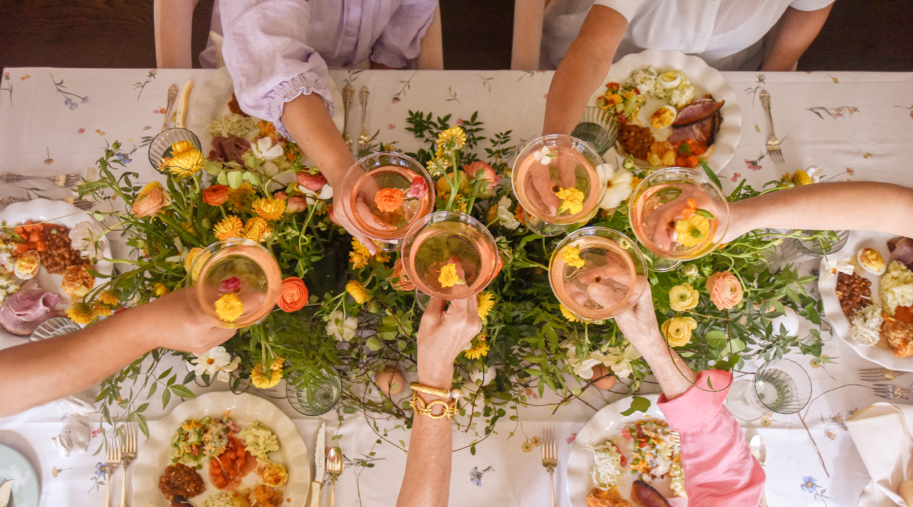
Don’t forget that your color palette extends beyond just the décor; matching your cocktail or dessert presentation to your chosen hues adds an extra layer of thoughtfulness and flair. For example, a coral-toned table can be beautifully complemented by a refreshing blood orange spritz, while blueberry tarts tie in perfectly with a navy theme. These small, curated details help create a fully immersive experience where every element feels connected and elevates the overall mood of your gathering.
Create a Mood Board
Creating a mood board is a great way to visually organize your ideas and bring your color palette to life. It’s a collage of images, textures, and elements that help you define the aesthetic and mood of your gathering. Not only does it spark creativity, but it also provides clarity and confidence when making styling decisions, ensuring everything feels well-balanced.

3 Approaches to Color Palettes
When it comes to setting the tone for your gathering or table, most color schemes fall into one of three broad approaches. Each style creates a unique mood and offers a clean, approachable starting point for designing a space that feels well-suited to the occasion. These approaches are:
1. Light and Bright
The light and bright look is all about creating an airy, cheerful atmosphere using soft whites, pastels, and sun-kissed hues. Think blush pink, sky blue, and pale green.
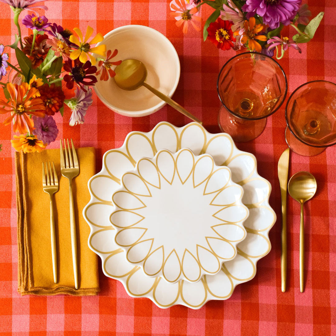
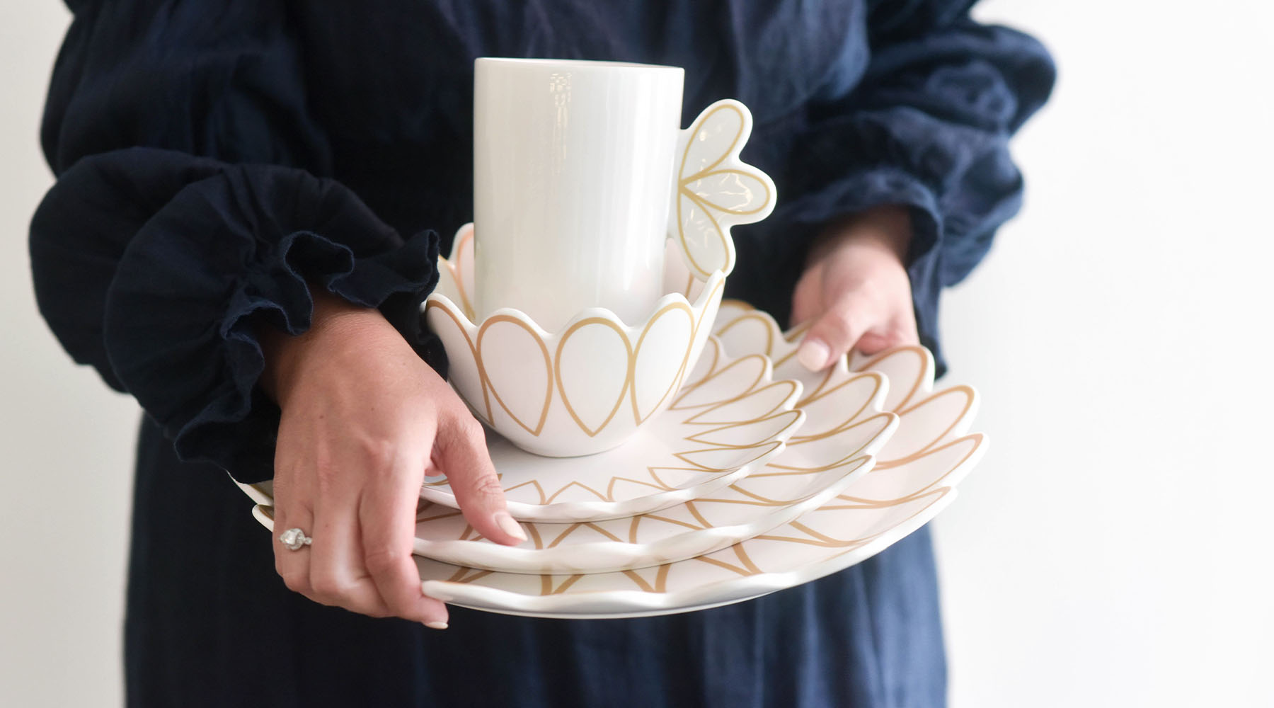
Ideal for spring brunches, garden parties, or baby showers, this palette reflects natural light beautifully, making any space feel open, fresh, and welcoming. Pair white dishes from our Signature White Collection or gold and white dishes from our Deco Collection with pastel accents, airy linens, light woods, and delicate florals to create a sense of ease, optimism, and effortlessness.

2. Warm and Earthy
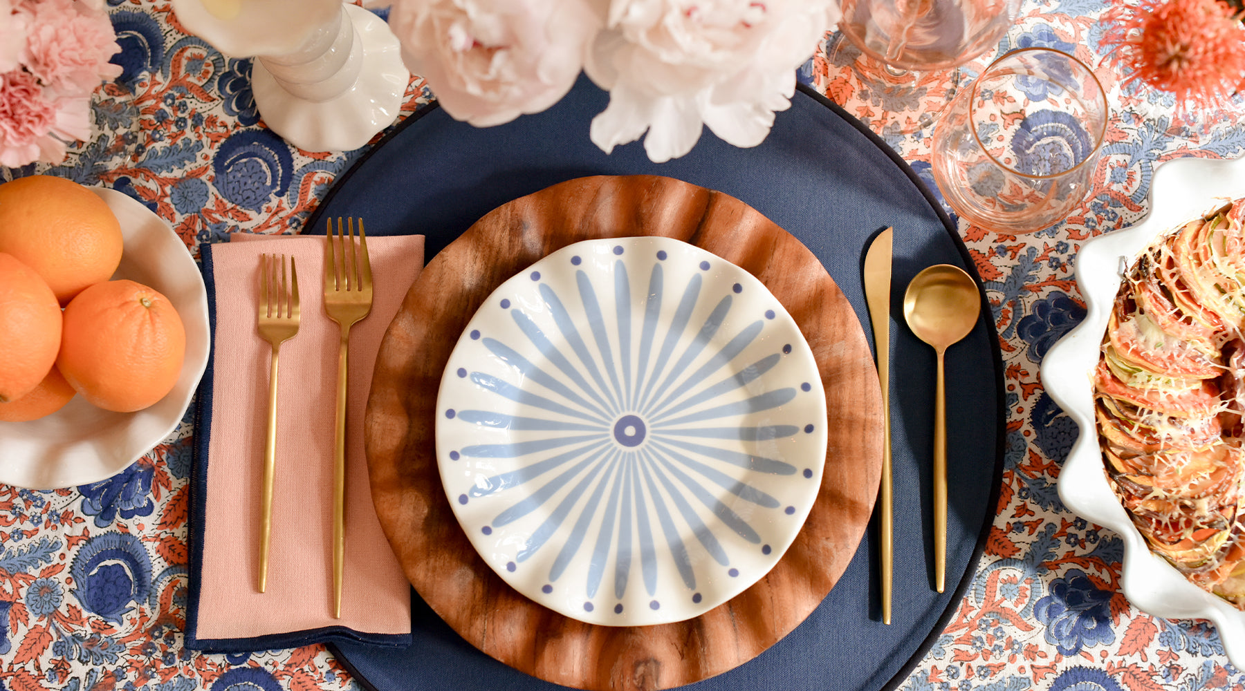
Warm and earthy colors draw from nature’s richest tones {think terracotta, olive green, mustard, rust, and clay} to create a grounded and welcoming atmosphere. Perfect for autumn gatherings, casual dinner parties, or cozy backyard meals, this palette invites guests to relax and stay awhile. Pair our acacia wood dishes with the earthy-toned color block placemats {Olive, Pine, Coquette, and Ecru} from our Fundamentals Collection to achieve this style with ease.

3. Bold and Colorful
Bring energy, personality, and a sense of fun to your gathering with a bold, colorful color scheme. With saturated hues like cobalt, fuchsia, citron, coral, and emerald, this approach is perfect for birthdays, summer gatherings, and themed events where you want to make a statement. Anchor your table with vibrant white and black dishes from our Crew Collection and layer in colorful accents for a lively, festive look that encourages conversation, joy, and unforgettable moments.

Color Schemes Based on Event Types
Another way to determine the color scheme for your upcoming party is to base it on the type of event you are hosting. Different gatherings call for different moods, so tailoring your colors to the occasion will ensure that every detail feels carefully selected and meaningful.
Casual, Laid-Back Gatherings
Casual gatherings are all about creating a relaxed and welcoming atmosphere where guests feel at ease. Playful, bright tones like citrus hues, sky blue, or grassy green bring fresh energy to the table, while earthy shades add warmth and comfort. When setting a casual table, consider using mismatched place settings and colorful linens to help maintain the lighthearted theme.

Sophisticated Dinner Parties and Formal Affairs
Sophisticated dinner parties and formal events come to life with rich jewel tones, monochromatic schemes, and shimmering metallic accents that create a luxurious atmosphere. Deep blues, emerald greens, and soft blacks set a dramatic and refined foundation, while touches of gold or brass in flatware, candleholders, and serveware add glamour. This combination elevates the visual impact and invites guests into an intimate, polished setting where every detail feels thoughtfully composed and effortlessly chic.
Seasonal Hosting and Holiday Parties
Seasonal celebrations present the perfect opportunity to let nature’s colors inspire your palette. Think crisp white and icy blues for a winter gathering, fresh leafy greens and soft pastels in the spring, vibrant, saturated berries and sunny hues in the summer, and warm golden ochres, rusts, and deep oranges to capture the essence of autumn. Using these seasonal hues helps create a setting that feels timely and in sync with the rhythms of the year.
When planning holiday and cultural celebrations, choosing colors that honor tradition adds meaning and respect to your event. Classic palettes, such as red and green for Christmas, pastels for Easter, or bold reds and golds for Lunar New Year, evoke familiar and cherished feelings. However, your palette can still feel fresh and festive as rich textures, patterns, and unexpected accents elevate even the most traditional schemes. Here are some ideas:
- Incorporate colorful napkins or textured linens.
- Use plates with designs or glassware with subtle holiday motifs {our Gold Star dishes in the O’Holy Night Collection are a holiday favorite}.
- Add metallic elements like gold or silver chargers and candleholders.
- Mix in natural elements such as pinecones, berries, or seasonal florals.
Base and Accent Colors for Dish Pairings on Your Table
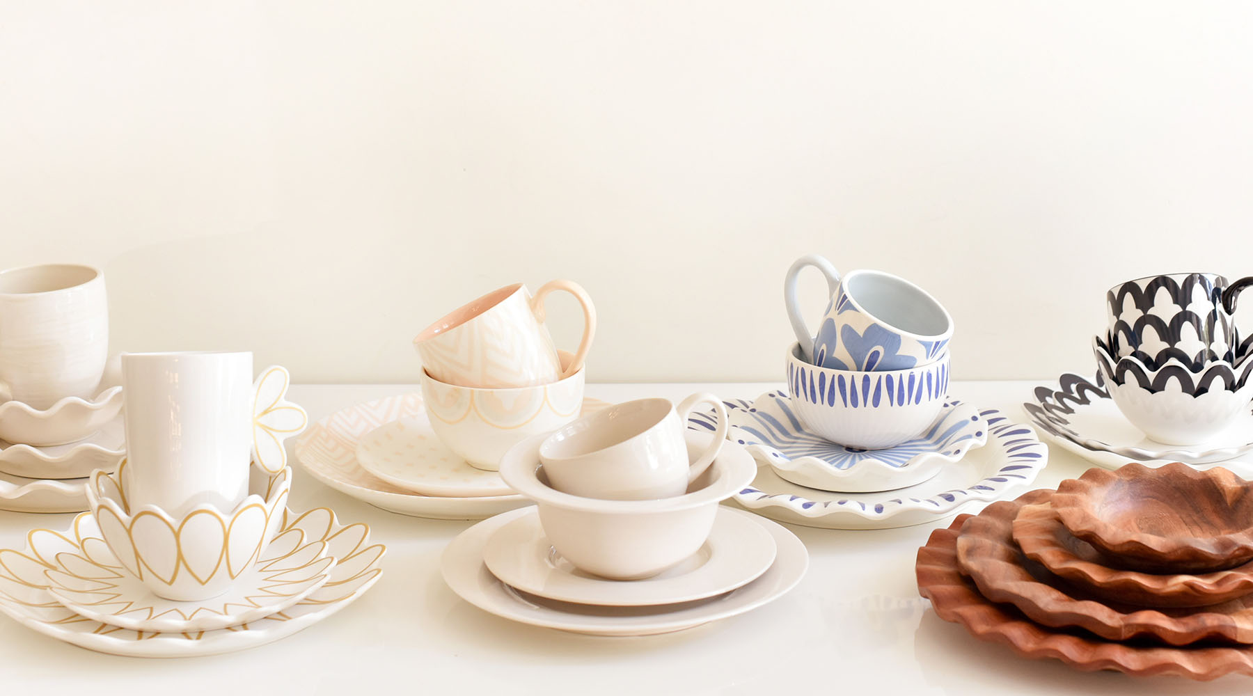
Choosing the right base for your table setting is the first step to creating a cohesive and inviting gathering. Whether you start with white plates for a crisp and neutral look, rich wood dishes, or a vibrant color, layering in the perfect accent hues will help bring your vision to life. Below are some ideas for pairing accent colors with popular Coton Colors collections so that you can mix and match with confidence.
 |
 |
Signature White Collection
The white dishes of our Signature White Collection serve as a fresh, airy foundation that pairs beautifully with soft pastels for a light and uplifting look. These colors include:
- Sage
- Blush
- Mandarin
- Apricot
- Lilac
For a more subtle and polished style, layer with soft blush and ecru tones, or add dramatic contrast with black and jewel-toned accents for rich, seasonal tablescapes.
The Fundamentals Collection
The wood dishes from our Fundamentals Collection are all about providing the perfect foundation for your table. This versatile base opens up endless possibilities for layering color. Whether you create a unified look by mixing hues already available in the collection or introduce complementary accent colors to add pops of saturation and visual interest, there are so many options to choose from.
Because the styles in the Fundamentals Collection are designed to balance both texture and color, they work beautifully with pattern play, allowing you to customize your palette to fit any mood or occasion. Selections from our Oyster Collection or Palm Collection complement the nature theme created by the wood plates.

Iris Blue Collection
With the stunning blue dishes found in our Iris Blue Collection, you already have eye-catching dinnerware and serveware styles. However, layering in various blue hues can create a timeless look while mixing and matching with fresh greens and crisp white plates create a serene style perfect for spring and summer events.
A Word on Lighting
Incorporating lighting is one of our favorite ways to curate an impressive centerpiece, and it can greatly influence how colors are perceived. Choosing the proper lighting helps set the perfect mood and brings out the best in your color scheme.
Natural light makes colors appear brighter and cooler, perfect for daytime events. In contrast, candlelight or dimmed lighting adds warmth and depth, enhancing richer tones and creating a cozy, intimate atmosphere ideal for evening gatherings.
With its ability to transform your table, elevate the entire atmosphere, and leave a memorable impression on guests, color is one of the most powerful tools in your design toolkit. Whether you prefer light and airy tones, warm and earthy hues, or bold and vibrant shades, your chosen color palette reflects not only your personal style but the intention behind your hospitality.




Leave a comment
This site is protected by hCaptcha and the hCaptcha Privacy Policy and Terms of Service apply.